Everyone is talking about AI. Is it going to make society into some Star Trek style utopia, or will we have to send Arnold Schwarzenegger back in time to save the world. I dunno. I’m kind of agnostic about it all. What I do know, is that I need to be able to use it as a tool as effectively as possible.
I’ve been spending much of my spare time learning about it and experimenting. I’ve taken online classes and created lots of things. Last weekend, I used AI tools to create some songs that I thought turned out really amazing. You tell me. I’m curious what you think.
I read an article about Google launching its new version of Nano Banana, (an image creating AI).
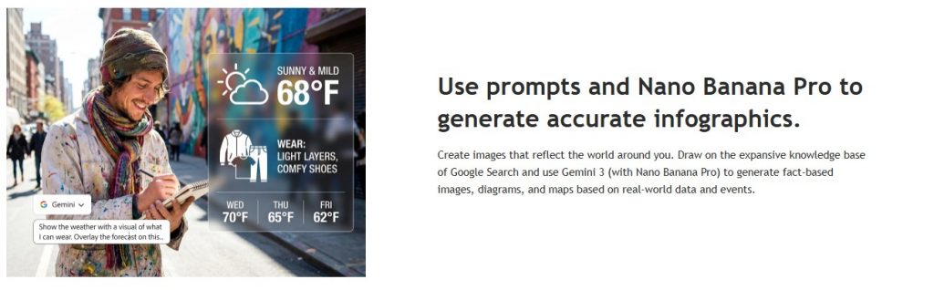
I wondered, how good it actually was at doing this. It would be amazing to just pump out infographics with ease. Also, were some of the other AI’s any good at this either? So, I made a little experiment. Read here if you are interested in the results.
Coca-Cola is a publicly traded company. That means that its financials and other company information are easily scraped from the internet. If anyone is interested, here are the general statistics over the last 10 years.
The Data
The Coca-Cola Company is publicly traded, and therefore, there is available, detailed financial information, including annual revenue.
The last 10 years have been a period of significant strategic transformation for Coca-Cola, focusing on re-franchising its bottling operations and shifting its focus to a “total beverage company” model. This is reflected in the revenue trends, which show a sharp initial decline followed by robust, consistent growth in recent years.
Here is a breakdown of Coca-Cola’s revenue and key growth-related statistics over the last decade (2014-2024).
The table below shows the annual net operating revenue for The Coca-Cola Company in millions of US dollars.
| Fiscal Year (Dec 31) | Net Operating Revenue (Billion US$) | Annual % Change |
| 2024 | 47,061 | 2.86% |
| 2023 | 45,754 | 6.39% |
| 2022 | 43,004 | 11.25% |
| 2021 | 38,655 | 17.09% |
| 2020 | 33,014 | -11.41% |
| 2019 | 37,266 | 8.65% |
| 2018 | 32,880 | -5.28% |
| 2017 | 35,410 | -13.50% |
| 2016 | 41,863 | -5.49% |
| 2015 | 44,294 | -3.70% |
| 2014 | 45,998 | -1.83% |
Source: Company Annual Reports (via financial data services)
The most interesting growth-related statistic embedded in this revenue data is the dramatic dip between 2014 and 2018 and the strong rebound from 2021 onwards, with the revenue showing positive growth over 2014 at the end of this period. Here are some poignant things I noted about Coca-Cola’s last 10 years of data.
2014–2019 Decline: The falling revenue during this period was primarily due to the company’s strategic decision to re-franchise its bottling operations globally, especially in North America. By selling off its capital-intensive bottling plants and shifting to a model where it focuses mainly on concentrate, marketing, and brand strategy, Coca-Cola exchanged high-volume, lower-margin revenue (bottling) for lower-volume, higher-margin revenue (concentrate).
2020 Impact: The revenue drop in 2020 was largely due to the COVID-19 pandemic, as consumption in away-from-home channels (restaurants, theaters, and events) plummeted.
2021-2024 Rebound: The subsequent strong growth (17.09% in 2021; 11.25% in 2022) demonstrates the success of the new strategy, combining post-pandemic recovery with effective Revenue Growth Management (RGM) initiatives (higher pricing and favorable product/package mix).
Using this Coca-Cola data, I can have AI’s create infographics that didn’t contain any proprietary information that I’d have to feed it if I were to have it create anything for my company.
There are a few big ones that I thought that I’d use to test their infographic creation capabilities.
- Gemini (Using Nano Banana)
- Grok
- ChatGPT
- Perplexity
- Claude
I will analyze the best infographic that it created, and I’ll show the rest, when available.
The Experiment
- I will ask for 3 versions of the infographic from each AI
- The initial question – Please create a good-looking infographic on coca-cola’s financials, highlighting the last 10 years. Focus on the revenue and how they have overcome financial challenges
- Follow-up #1 – please design a different infographic with different design and focusing on different data points
- Follow-up #2 -please design a different infographic with different design and focusing on different data points
Here’s the TL;DR – if you want to read it, click to expand. If not, then come back to it later.
If you are using AI, good job! – You are using a tool that will make what used to take you a whole day, week, or month to accomplish into a task of only a few minutes. However, be careful. It will lie to you…like sometimes intentionally. When you have it create something, get excited, and then step away. It’ll still be there when you get back. Don’t worry.
When you come back, look very closely. If you aren’t seeing any problems, you might not be looking closely enough. Reagan was right, trust but verify…which really means don’t trust at all. Sometimes, what it gives you is just a creative spark that will make what you create actually quite good.
If you aren’t using AI, oh no! – Be prepared to become a slow, lumbering vestige of times gone by. You will be seen soon as the human version of a film camera flash cube.
There was a clear winner in this AI infographic challenge—Claude. Nothing even came close.
So, here goes…
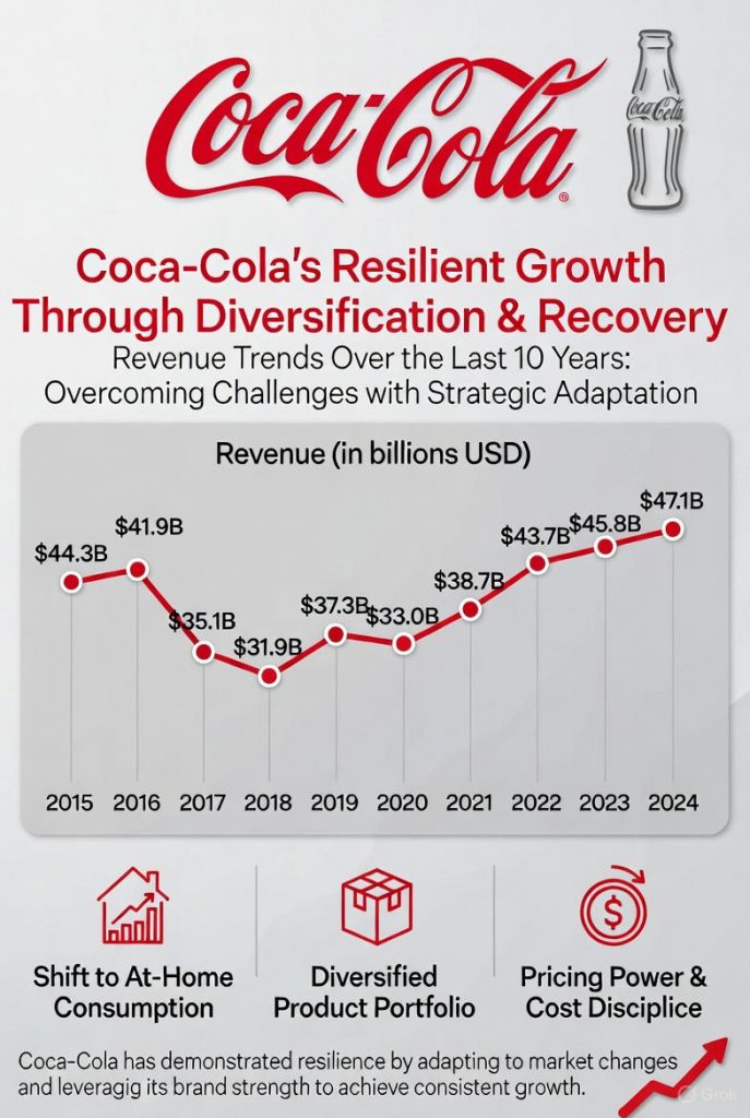
Gemini
The designs that I did not pick didn’t really address the main questions at all. They made up some data points and didn’t look visually interesting.
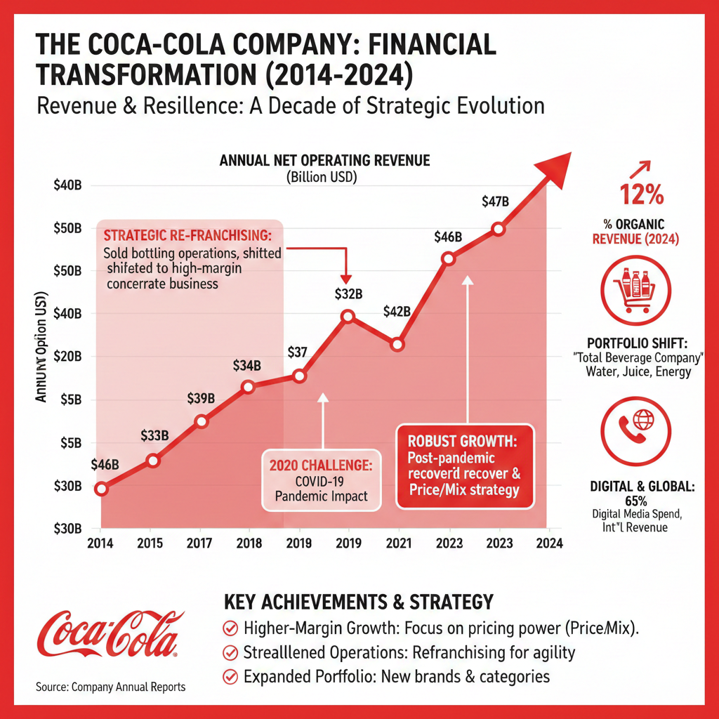
When I tried this on my own prior to the test, it only made one design and would then show me a new design that was identical to the first. When I’d catch it doing this, it would say “Sorry, you are right. Here is a different one.” Then it would show me another identical design. I’ve had it do this before.
I thought this design looked nice and was close to what I wanted. It impressed me at first.
As I looked closer I noticed a few things that stood out, and you’ll see general trends of these things for all of the AI’s.
Here are the scores.
Design – There is just a LOT of stuff. The colors do go with the Coke theme, but it also seemed not quite centered. Design Score: C-
Content – Not only are the numbers on the chart incorrect, but they also don’t make any sense. $33B in 2014 is not more than $46B in 2015. And that is just a start. Just think about this, 2023’s number is the same as 2014. It doesn’t make sense.
There are a lot of sections with spelling errors that are more like nonsense. The red shaded area doesn’t actually cover the right place, the 2020 pandemic arrow doesn’t point to 2020, etc. I will say that now I want to brag about “strealllened Operations.” Content Score: D-
Cool factor – The design looks visually interesting. It is a good idea to go off of. Cool Score: B
Final score: C-
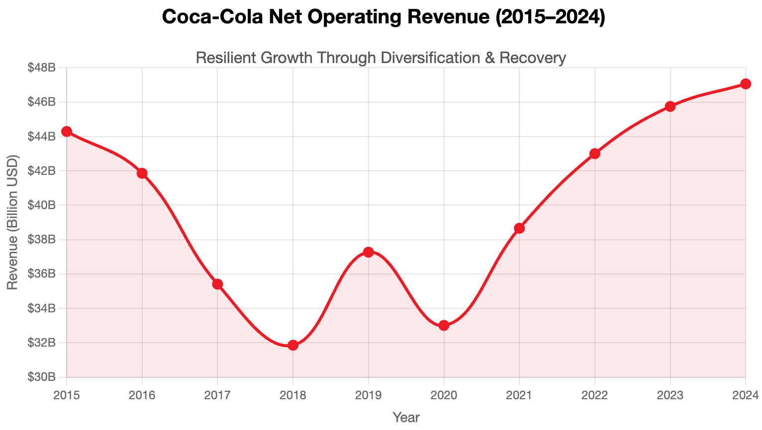
Grok
This is the most interesting of the designs. The first one is great, although what Grok designed was animated which did not save in the image.
Here are the scores.
Design – I think this is one of the best designs. The Coke logo centered with the bottle next to it is very strong. The H1 text in the same color scheme is also good. Actually, good color discipline and font choice. The blocky-ness balances the calligraphy of the logo. The design needs more air, though. It is way to packed and offends me that way. It feels like too much to read. Design Score: B-
Content – First, and most importantly, the numbers are very wrong. Also, it seems like AI can’t figure out how charts work. I will investigate this. The header didn’t have to say “(In Billions USD) at all. Coke is an American company, there is a $ at each point and a B. One or the other, but from a design standpoint, it might have been better to put something like “(in Billions)” at the header with no dollar sign, or B at each point. Also, the data labels need to be spaced better, maybe with ascending values above and descending below. Finally, AI designs seem to have a hard time no putting nonsense text. It almost made it all the way, but it feels like an addict in that sense. The very last line had “leveraging.” It couldn’t help itself. Content Score: C-
Cool factor – This one is quite good. If I were designing, I might have used this as inspiration. Cool Score: A-
Final score: B-
ChatGPT
The designs that I did not pick were virtually identical to this, but slightly busier graphically.
It did ask me if I wanted to have it redesign this using Coke’s colors and logos. I didn’t tell it to, since that wasn’t part of the experiment. I think that it should have done this on its own.
Here are the scores.
Design – This is very poor. Of course, these colors are not at all Coke’s, but the design also feels poorly done. The bottom of the chart interfering with the Pandemic Impact box. Design Score: F
Content – The important thing in the chart is that the numbers seem correct. That is a huge plus. The boxes below are ok, but they have no label saying what they are. Further, that seems to leave out the story that the chart above it is telling. Content Score: C
Cool factor – Whatever things make an infographic cool, this is the opposite of. Cool Score: F
I don’t have a slider for this because the images were not much different at all.
Final score: D
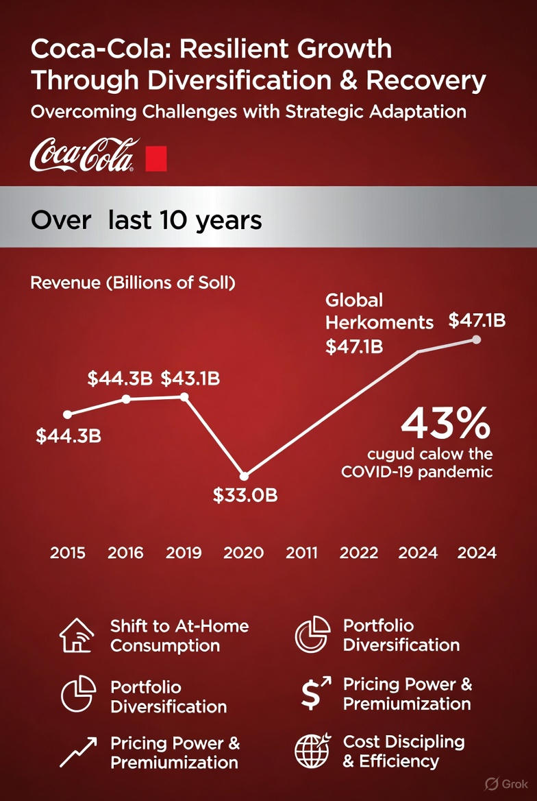
Perplexity
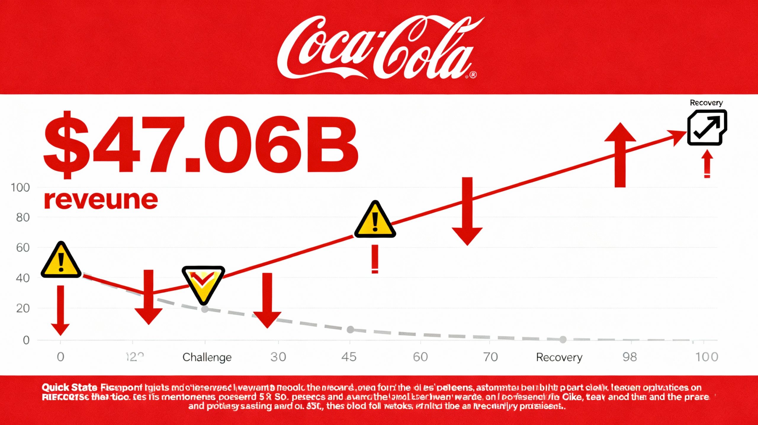
The other designs weren’t bad, but had too much nonsense and weren’t as interesting as this.
Here are the scores.
Design – Perplexity went a different direction with this than any of the other AI’s. I like that. It also used the Coke logo and colors. It also chose cool blocky fonts. It should not have used the weird “Recovery” icon on the right, and instead of the nonsense at the bottom, that would be a perfect place to detail what the warning exclamation points were detailing. Finally, the arrows were overused and nonsensical. Design Score: B+
Content – The $47.06B refers to its earnings for last year. I know that, because I’m looking at the numbers, but at least give that one an arrow or context. The biggest thing is that the axes don’t make sense at all, making the line not mean anything either. Revenue was steadily going down until 2021. Showing what could have happened if a turnaround hadn’t happened is very cool, but the line wasn’t a straight line down, and it hasn’t been up either. With real data points (even unlabeled) and the “coulda been” curve, the idea is great. Once again, AI loves nonsensical text. Content Score: C-
Cool factor – This one has great street cred. If I were designing, I definitely would have used this as inspiration. Cool Score: A
Final score: B
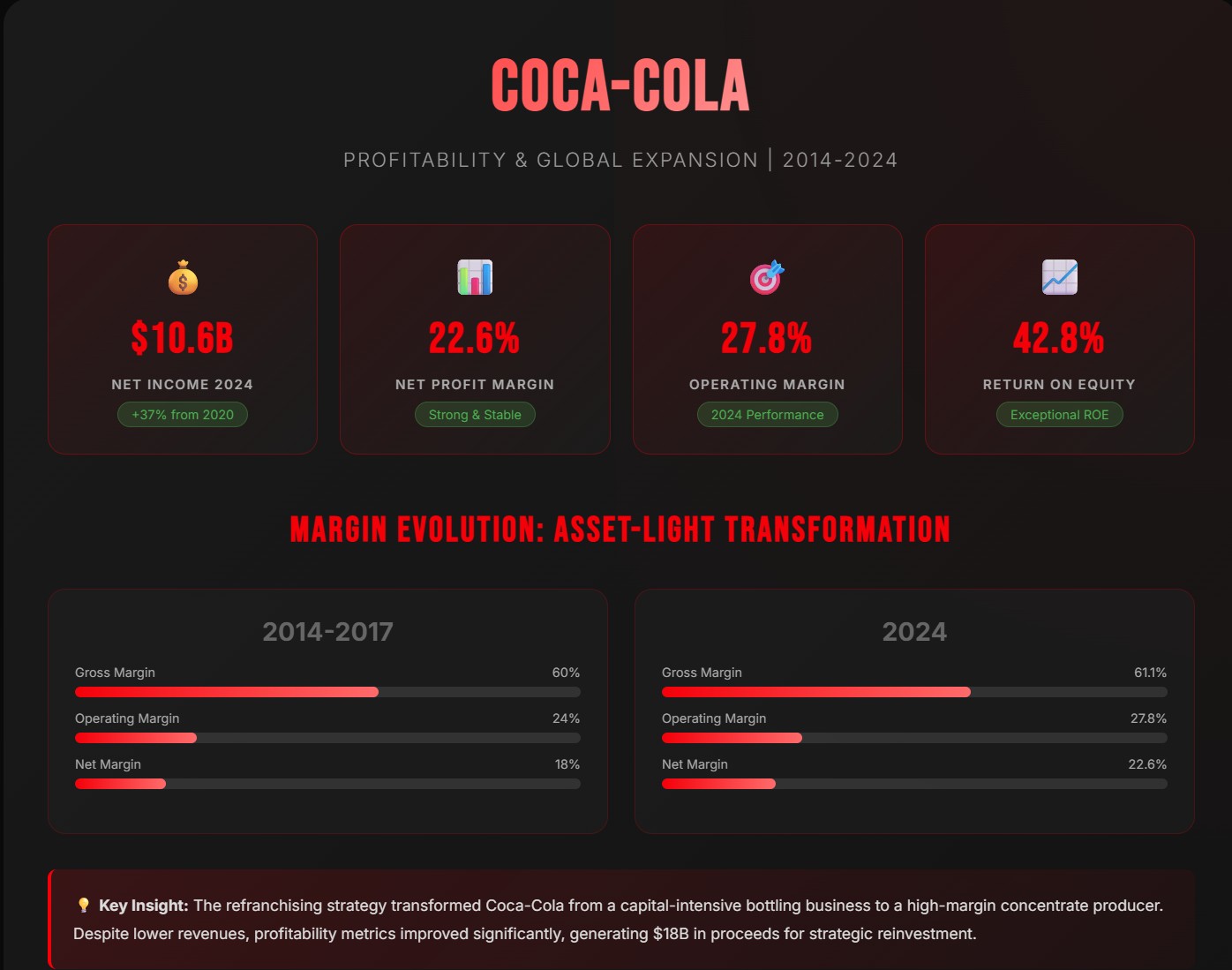
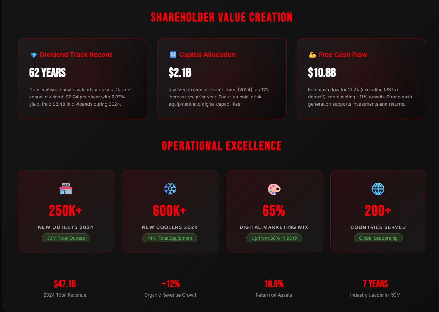
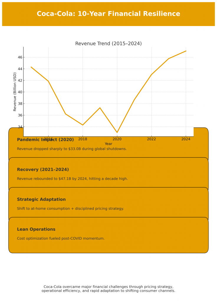
Claude
First off, what a person should understand about Claude is that it is AI that specifically is meant to design HTML code. This is not a graphic, but web design, and it’s a good one. It loses a lot of its splendor when viewed as only an image. There’s a ton of animation going on here.
🥤 COCA-COLA
Financial Journey 2014-2024: A Decade of Resilience
🎯 Overcoming Financial Challenges
Strategic Refranchising -24% Revenue
Coca-Cola transitioned from capital-intensive bottling operations to an asset-light model. The company refranchised bottling territories, reducing revenue but dramatically improving margins. Generated $18B in proceeds to fuel strategic investments.
Portfolio Transformation +9% Growth
Diversified beyond carbonated drinks into healthier options. Focused on premium products and innovation. Improved operating margins through streamlined operations and better cost management.
COVID-19 Pandemic Impact -11.4% Decline
Revenue dropped to $33B as restaurants, venues, and offices closed globally. Away-from-home channels severely disrupted. Company quickly pivoted strategy, reduced investments, and optimized cash holdings for stability.
Strong Recovery & Acquisitions +28% Growth
Rapid revenue rebound as markets reopened. Strategic acquisition of BodyArmor for $5.6B strengthened sports drink portfolio. Enhanced digital capabilities and e-commerce presence. Added 250,000+ new outlets globally.
Sustained Growth & Innovation +9.5% Growth
Revenue reached $47.1B, approaching pre-refranchising levels with much higher margins. Organic revenue growth of 12%. Focus on premium offerings, cold-drink equipment expansion (600,000+ new coolers), and market share gains across all regions.
Of course, it isn’t actually creating an infographic, really. Asking it to design a graphic, instead of a website is a bit like asking a 4-star chef to fly an airplane. He doesn’t fly planes, he roasts veal. I can’t deduct any points from Claude for simply doing what Claude is supposed to do.
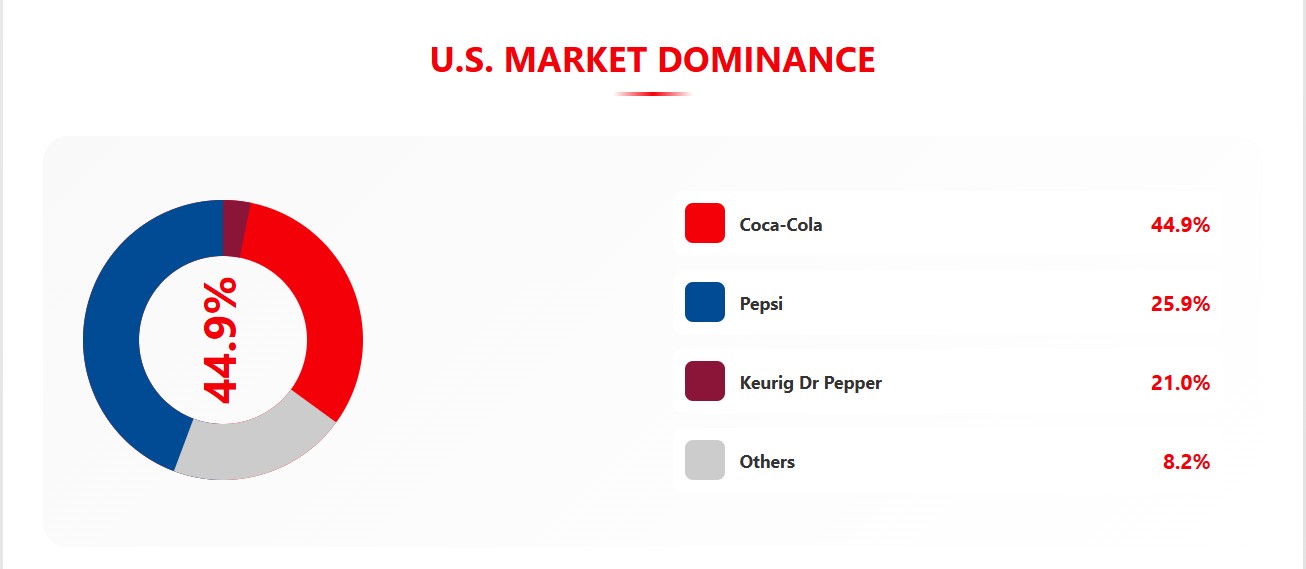
The other ones bordered on incorrect data and charts that made no sense, like the example at the bottom.
It’s a great idea, but everything about the bottom example doesn’t make sense. I almost get joy out of it. It is like the heroes of German lore somehow blessed this with Schadenfreude.
But we aren’t talking about that one. We are talking about the top one. Here are the scores.
Design – The only thing, and I do mean the ONLY thing that I don’t like here is that it didn’t have the Coca-Cola logo at the top, but it may be that Claude is not able to do that. I will check. Design Score: A+
Content – Every single number that I checked was correct. Every single word that I looked at was correct. In the Overcoming Financial Challenges section, the points look like they are meant to be full sentences. If so, they lack nouns and sometimes helping verbs. They really should be bullets. Content Score: A-
Cool factor – This one is cool. The animations are fun. It tells the story, and I want to read it. Cool Score: A+
Final score: A+